Your house is running Home Assistant now. A handful of automations are firing. A few integrations are talking. You open the app on your phone, and it shows you the default dashboard: a pile of auto-generated cards in no particular order, every entity in the house listed as if they’re all equally important, with a header that just says “Home.” You stare at it for a minute. You close the tab. Again.
So. What does a good home assistant dashboard for beginners actually look like, and how do you build one without falling down a rabbit hole?
The default dashboard is a safety net, not a destination. It exists so the app has something to show you on day one. The real dashboard, the one you’ll actually open five times a day, you build in an afternoon with five card types and a little restraint. This guide walks through that.
The 30-second version
Switch to the Sections layout. Build one dashboard with three views: Home (the landing page), Lights, and a third for whatever you use most (climate, media, or cameras). Use five card types: Tile, Area, Weather, Glance, and Markdown. Keep it boring. Resist every custom card you see on Reddit for at least a month.
The philosophy: less is more, and the phone wins
Before you touch anything, a rule that will save you hours of fiddling: the dashboard is not a showcase. It’s a tool. Every card on it should earn its spot by answering one of two questions. Do I need to see this? or Do I need to tap this? If a card does neither, it doesn’t belong.
Second rule: design for your phone, not your monitor. You will open this dashboard in bed, in the kitchen with one hand, from the driveway when you forgot to lock the door. Any layout that only looks good on a 27-inch monitor is the wrong layout. Check the mobile view constantly while building.
Third rule: the landing view should answer one question in one glance — is everything okay? If you have to scroll to find out, the layout is wrong.
Use Sections, not the legacy layout
Open your dashboard, click the three-dot menu in the top right, pick Edit Dashboard. If this is a new install, you’re probably already on the modern Sections layout. If not, create a new dashboard and pick Sections when prompted. The older “Masonry” layout (which Home Assistant still supports for backward compatibility) is harder to make look good. Start on the modern path.
Sections works like a grid of boxes you drag around. Each box holds a few cards. You can resize boxes, add new ones, and move them freely. It’s easier than it sounds once you have it open in front of you.
Build your first view: Home
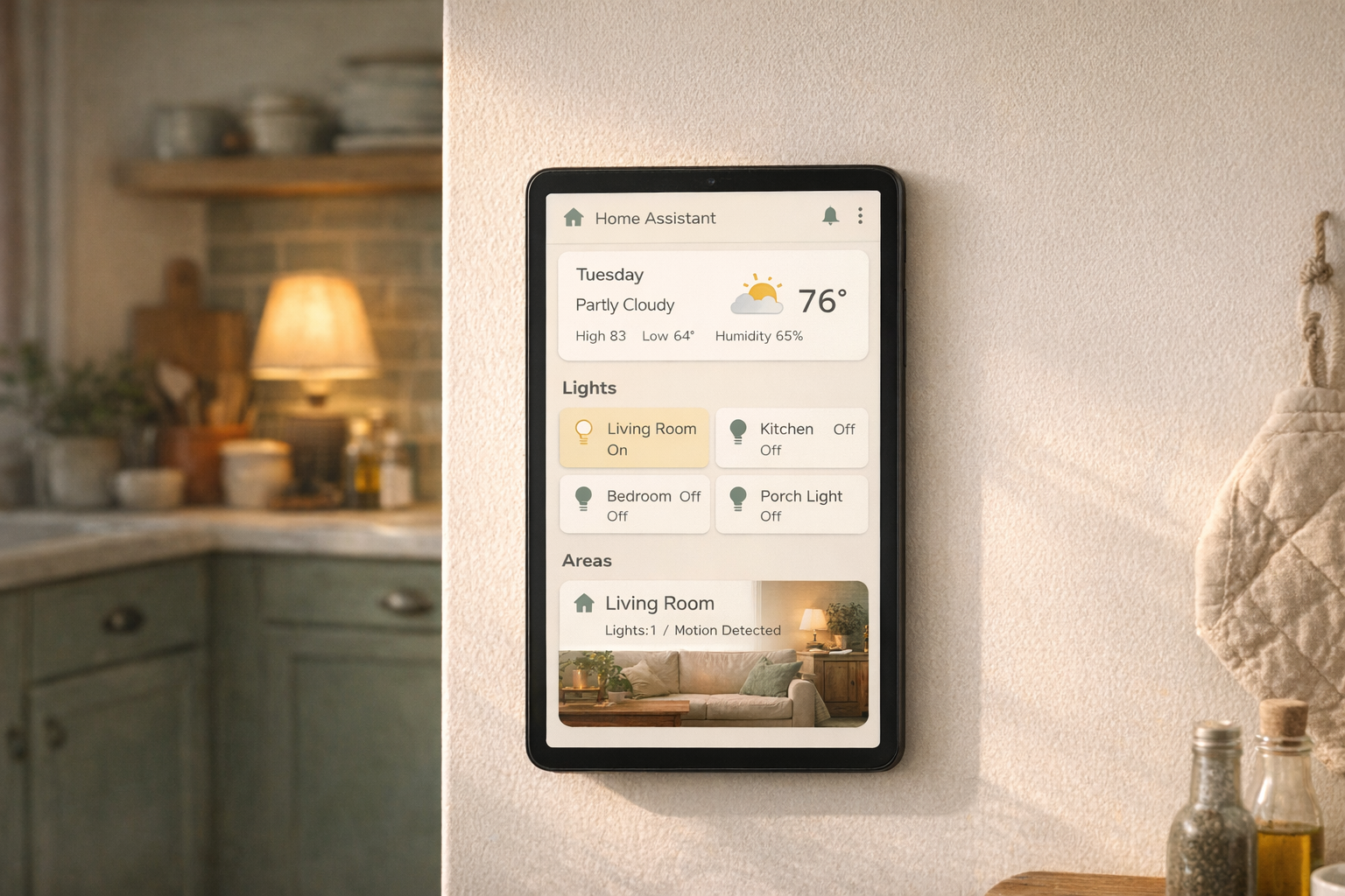
This is the landing page. Keep it small and honest. Four sections, no more.
Section 1: Status glance. Add a Weather card at the top (using the integration you set up in the integrations guide). Under it, a Glance card with four or five key states: front door lock, garage door, thermostat, and maybe your car’s battery level if your car integrates. This answers the “is everything okay?” question in two seconds.
Section 2: Most-used controls. A row of Tile cards for the five or six things you touch most often. For most people: living room lights, kitchen lights, porch light, thermostat, and a “Good Night” script button (from the first-automations guide). Not twelve buttons. Five or six.
Section 3: Who’s home. A Glance card showing each person’s presence status. Helpful because it tells you at a glance whether anyone is around and it confirms your Companion app location tracking is working.
Section 4: Notifications or recent activity. An Entities card filtered to your most-used automations or a small Logbook card. This is the one that tells you, when something feels off, whether an automation actually fired.
That’s it. Four sections, one view. Ninety percent of your daily use lives here.
Build your second view: Lights
Click the + next to the view tabs at the top of the dashboard. Name it Lights. Pick Sections layout again.
The easy win here is the Area card. If you’ve been diligent about assigning devices to rooms in Home Assistant (Settings → Areas), the Area card does most of the work for you. One Area card per room, placed in a grid. Each card shows the room’s lights, temperature, motion, and any other assigned devices. Tap to expand for controls.
If your rooms aren’t set up yet, go to Settings → Areas and spend ten minutes assigning devices to rooms first. It’s worth the detour. Every Area card you add after that just works.
A third view, your choice
One more view for whatever matters most in your house. Pick based on what you actually use:
- Climate, if you’re optimizing heating and cooling. Thermostat card, a graph of temperature trends, humidity.
- Media, if you stream a lot. Media player controls for your Chromecasts, Sonos speakers, Apple TVs.
- Cameras, if you have doorbell or outdoor cameras. Picture-glance cards with live snapshots.
- Energy, if you have solar or a smart panel. The built-in Energy dashboard.
Stop at three views. A fourth can come later, once you know what your real daily flow is.
Five card types do most of the work
You do not need to learn every card Home Assistant offers. These five handle the vast majority of what a beginner needs:
- Tile — the workhorse. Shows a single entity with icon, name, and status. Use for most controls.
- Area — collapses a whole room into one card. Best when your rooms are set up.
- Weather — shows forecast, current conditions, optional radar.
- Glance — a compact row of entity statuses. Use for presence, door sensors, and critical checks.
- Markdown — plain text notes, headings, or the occasional reminder. Underrated for labeling sections clearly.
Six months from now, you’ll probably add one or two more from the community. You do not need them today.
The honest downsides
Dashboards are the part of Home Assistant most likely to eat a weekend you didn’t plan to spend on them.
The community gallery on Reddit is a minefield. You will see dashboards that look like custom-made apps, with weather icons you’ve never seen, sidebars, and animated backgrounds. These take tens of hours of YAML editing and third-party card installs through HACS. They’re beautiful, and they’re not beginner territory. Chasing them on day one is how people burn out of Home Assistant before they build anything useful.
Also: dashboards rarely look the same on phone and tablet without tweaking. You’ll add a card that looks great on your laptop and find out the next morning it’s cut off on your phone. Check both regularly.
One more. When a custom card breaks after an HA update, it doesn’t always break gracefully. You’ll open your dashboard and find a red error box where your favorite card used to be. Built-in cards are much more stable. Stick to them for as long as you can.
Who this is right for
If you’ve got Home Assistant running, a few integrations added, and you’ve stopped opening the default dashboard because it feels like a spreadsheet, this is your fix. Spend an afternoon. Build three clean views. Ignore the fancy stuff.
Who should wait
If you haven’t yet installed Home Assistant or added your first few integrations, those are the earlier stops. A good dashboard needs devices to show. Build out your integrations first, then come back.
The best dashboard is the one you open every day and feel grateful for. Everything else is a hobby.
What to read next
- What integrations should you add first? — the prerequisite for anything showing up on a dashboard.
- Your first 5 Home Assistant automations — the scripts and automations your dashboard buttons should trigger.
- Zigbee vs. Z-Wave vs. Matter vs. Wi-Fi — coming soon. The protocol decision that shapes which devices end up on your dashboard in the first place.


